Release notes for version: 13.0.0 + 13.1.0 (Major)
Contents
Left menu and top bar configurability
Migration from Tasks from filter widget
Knowledge base vs Knowledge base Legacy
API change for Lookup custom fields
Technological stack
This section is important for Server solution. Cloud users need not worry about any of this.
- OS: Debian 11 on amd64 architecture
- Redmine: upgradable from version 5.0.5
- Ruby: 3.1.2
- Bundler: 2.3.7+
- Rubygems: 3.3.x
- Database: Percona/MySQL 8.x
- redis-server: 5+
- NodeJS: 18.8
- Docker engine: 20.10.22
- Docker compose: 2.15.1
Before every upgrade, please carefully refer to all release notes between your existing version and the new version - there may be critical technical or functional changes explained.
Scrum boards - the next generation
This is no sci-fi (😉), but quite the contrary - the most authentic and precise projection of Scrum principles into a piece of software.
Scrum boards are a part of the Essentials plan => no need to buy anything new.
This approach to scrum management is independent of tasks, which allows a freer cooperation - without restrictions like workflow, required fields, milestone dates, and others that are not truly compatible with the scrum approach. We closely consulted with a certified scrum expert to correctly cover the key principles.
From the technological perspective, it allows collaboration in a next level by allowing multi-user changes in the live scrum board (such as in specialized whiteboard applications like Miro or Mural), of course, with conflict prevention mechanisms.
What about the existing Agile board?
Scrum boards are a brand-new functionality, and are in no way related to the existing Agile board (scrum project module) in previous versions. By upgrading from an older version, your original scrum project module will remain active. In addition, you will find the new Scrum boards so you can start grasping their concept which we passionately believe is THE proper scrum way.
If Easy Project 13 is your first version, you will receive only the new Scrum boards, quickly propelling your delivery of such projects to your customers.
Why a new functionality, if there already is one?
Our main goal is harmonic cooperation between users of our software. Through this our users may be enabled to deliver better products to their customers. That is why the new Scrum boards were consulted with a scrum expert, whose goal is aligned with ours. The resulting product is just too different from the original scrum project module, so it couldn't be implemented as an upgrade of existing functionality.
Terminology
There are some new terms used in this article, as well as changes in texting within the application. The goal of the standardization is to help users' understanding of our application, as well as better understanding between users and our representatives, when solving issues or just generally discussing the application.
Please check this document for the list of the terminology changes.
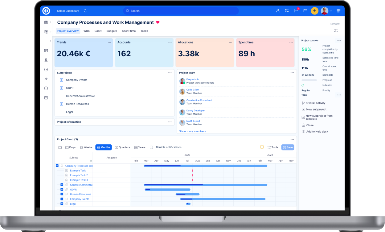
Design and layout
The listed changes are in comparison with v12.
Left menu redesigned
Left menu changed from individual buttons to a functional coherent section. Submenu expands down, instead of sideways.
If the left menu is collapsed, clicking on a submenu expands the left menu, so you can easily find your item. Then, when you click on the submenu item, the left menu will automatically collapse again. Thus, if you are used to collapsed left menu, it remains remembered even after it was forced to expand due to submenu showing.
Why the change?
Previously, the left menu buttons felt like just heavily floating in space, but not really fitting into the application layout.
Submenu expansion down instead of to side reinforces the coherence of the menu as a whole.
Top bar contents - summary
The top bar has been enhanced, here are the changes:
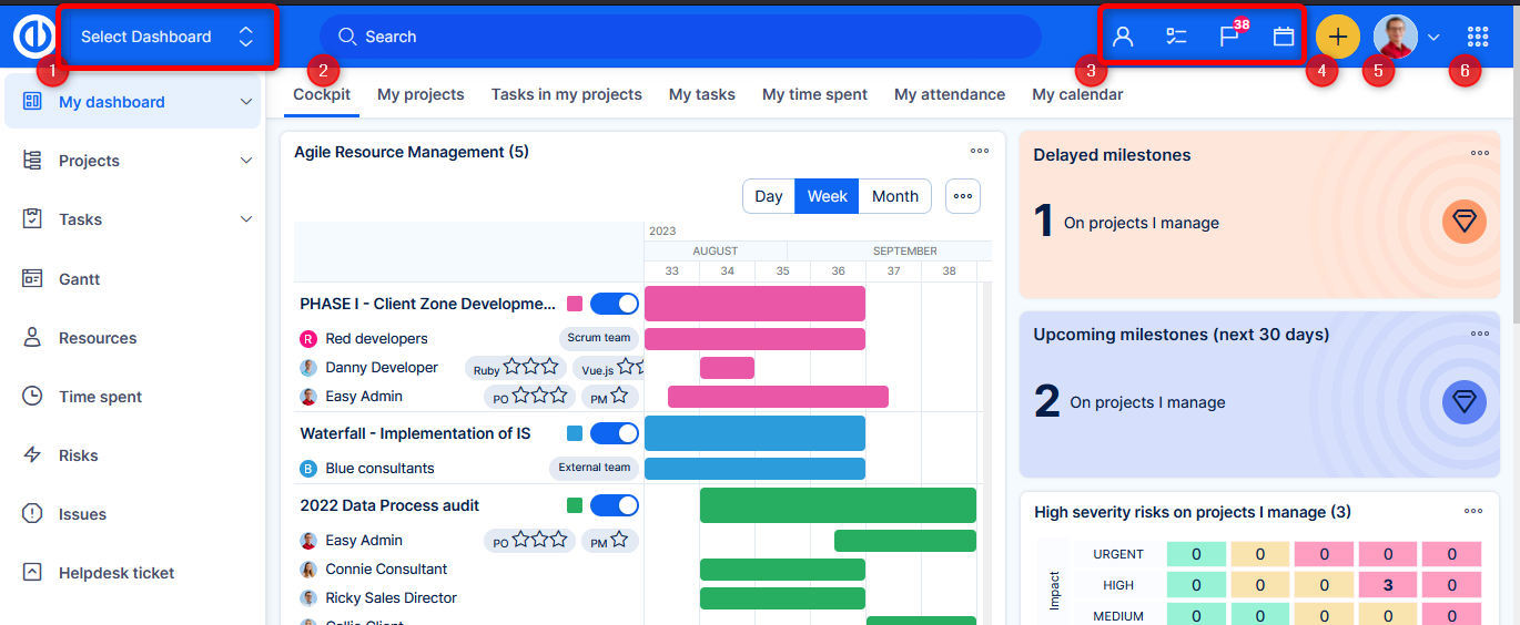
- Jump to dashboard - new feature in v13, explained in more detail further in this article
- Search is wider and in the center. It also has a keyboard shortcut "/"
- Toolkit - calendar and controls from the removed right service bar
- Plus button - moved here from previously floating somewhere near the bottom right corner. There was no proper place for it down there. In mobile view, plus button stays on bottom right, to be easily accessible by the thumb.
- User profile with submenu - the submenu contains dark theme toggler and log out button. The log out button is no longer a part of the global menu, neither has it a separate button in top bar. User profile is always available in the top bar (can't be disabled as before), therefore you will always find the log out button here.
- Global menu - admins will have access to Administration from this menu, as well.
Why the change?
We decided to utilize the potential of the top bar, at the same time enlightening the application by removing the right service bar.
Removed right service bar
Buttons from the service bar (activity feed, to-do list, etc.) were moved to the top bar.
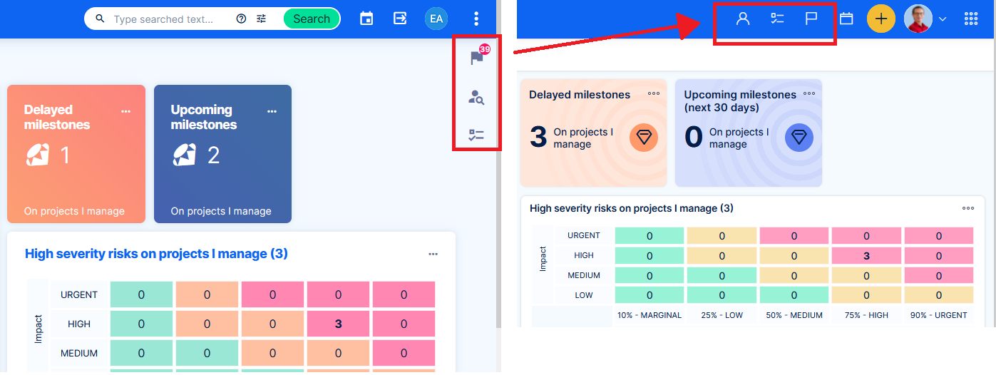
Why was it removed?
The service bar on the right was excessive, especially on pages with another (more useful) sidebar (such as task detail or task list). Top bar has plenty of room to accommodate this toolkit.
Instant dark mode toggling
Every user can immediately switch between dark / light theme under the profile toggler in the top bar. It is no longer required to edit whole user profile to switch the theme.
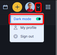
Dark toggler does not work with custom themes at the moment. Custom themes are delivered in a way which is currently incompatible with this feature. There are plans to erase this limitation.
Why the change?
To save time, for better adaptability. It was also a part of a bigger technological level up.
Icon set change and unification
Previously there were more inconsets in various places (menus, custom selections, hardcoded views,...), impairing the overall impression of the application pages. Now every icon in the application comes from one icon set, based on Nucleo icons.
They are lighter - using outline style instead of filled style of the previous icons.
This step has effect on native icons throughuut the application, but also on custom icon selection, that is available on trackers, trend widget and custom menu items (user type settings). After the upgrade you might want to check some of your most used items with custom icons.
Icon selection in trends widget v12 vs v13
v12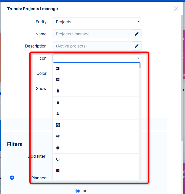
v13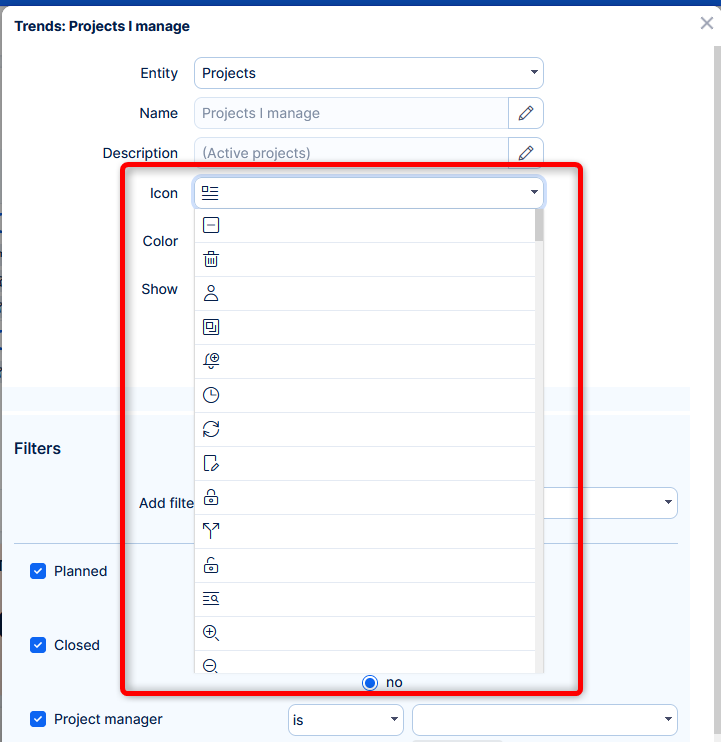
Icon selection in user type - custom menu setting v12 vs v13
v12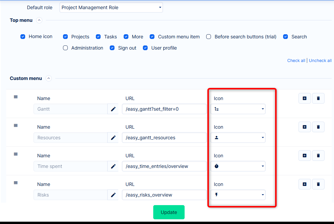
v13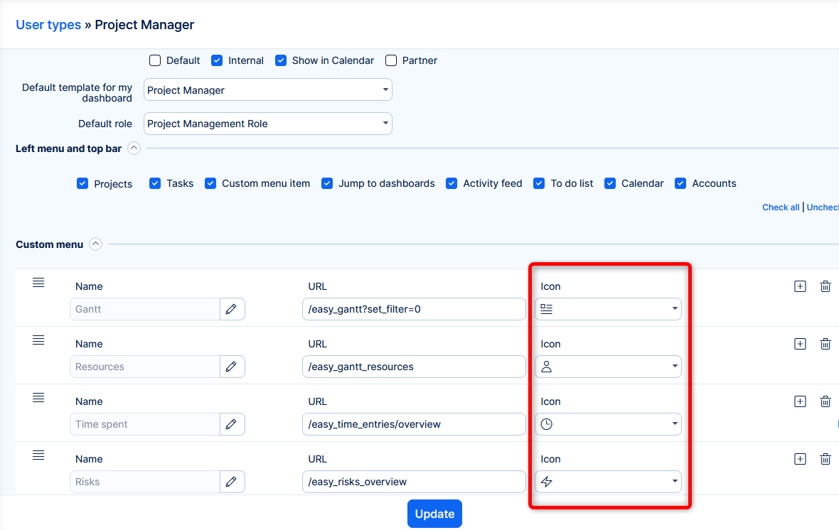
Why the change?
A single icon set is plain common sense.
Nucleo icons are a professionally maintained set. Outline style makes the icons lighter, thus putting less emphasis on them => less distraction => more work focus.
Task detail refreshed
In v12 we made improvements for task edit and new task forms (and some others). Now, in v13 design, we refreshed the task detail.
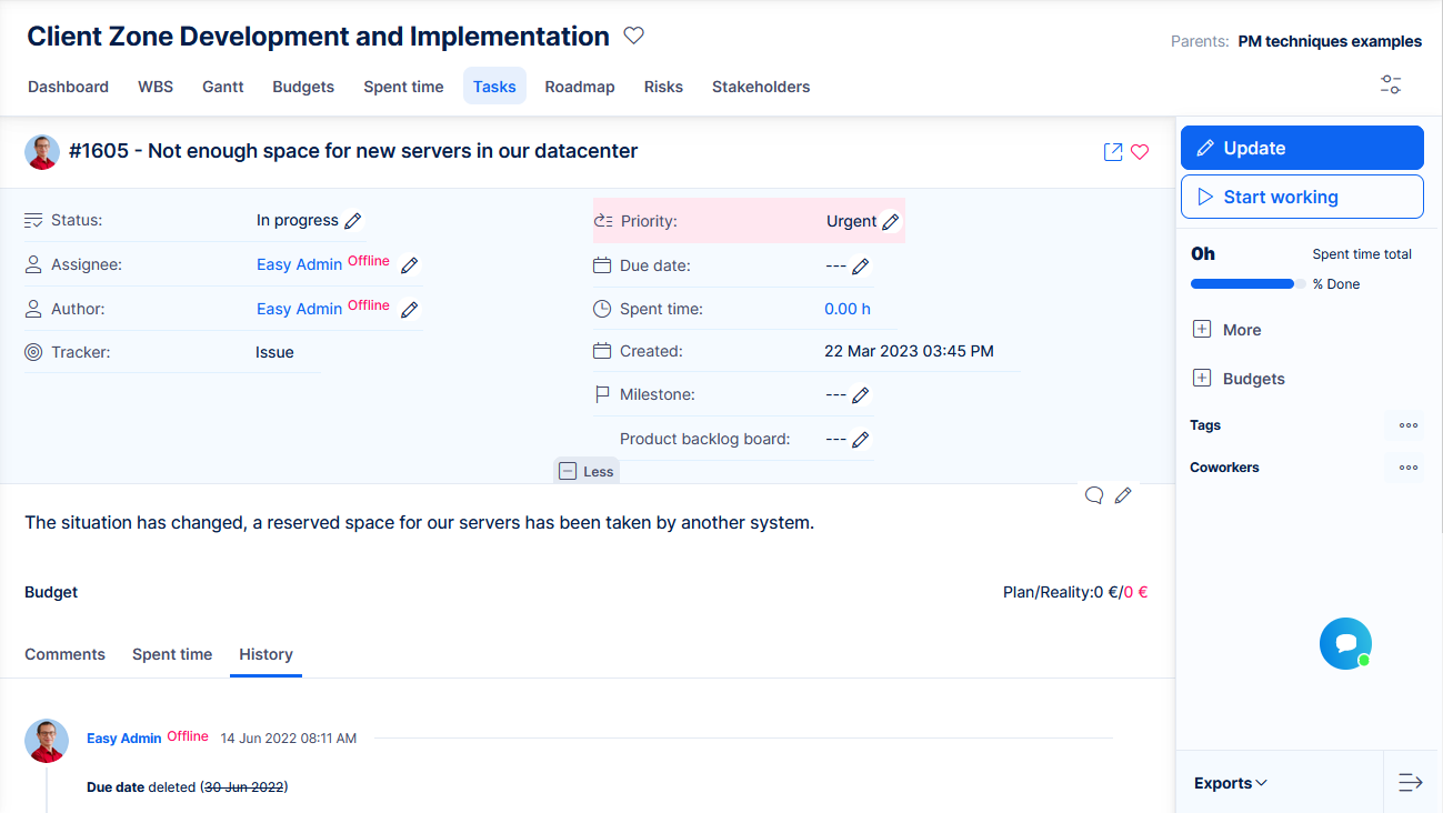
- Added icons next to native task attributes
- Recolored background behind attributes
- Sidebar made more compact
Why the change?
Task is the most used entity in the application, we decided it should look more representative, but most of all, better readable.
Dashboard widgets redesign
Mostly notable on Trends, when an icon is selected.
Administration tweaked
Just a little visual boost for the admins daily work.
Compact theme removed
Users can no longer select compact theme.
Why was it removed?
Maintenance of regular + compact themes became too cumbersome and practically caused quality deterioration of the compact theme.
Our research found low use of the compact theme. We decided to focus on the best possible form of the single (regular) theme, including optimizations to “compactize” the views where users need to see more data.
However, the new technology which allows instant dark theme toggling provides also the possibility to implement instant "density" toggling. Such option may be considered in the future based on user feedback.
Project breadcrumb moved to the right
Parent projects have been moved to a less prominent spot.
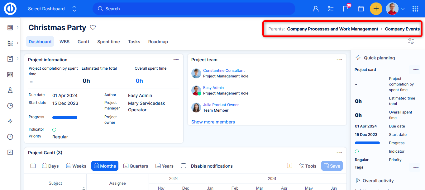
Why the change?
It helps with general orientation in project context and readability of the name the current project. Also, there is more room on the right for this secondary information.
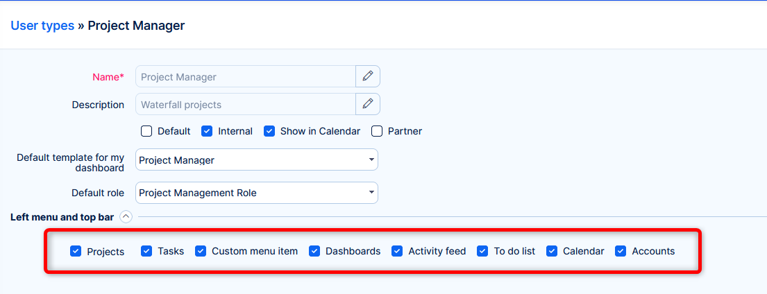
Left menu and top bar configurability changes (user type setting)
Configurability of user type (enabled/disabled items in left menu and top bar) has been updated to reflect the new layout, avoid misconfiguration and improve usability. Changes listed are in comparison with v12.
v13
v12
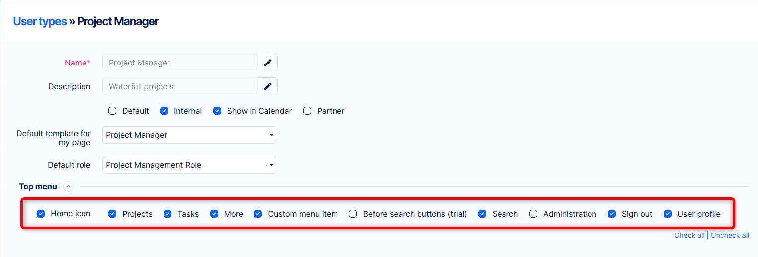
| Home icon | ➡ | Removed setting => My dashboard will always be available |
| Projects | ➡ | No change |
| Tasks | ➡ | No change |
| More | ➡ |
Removed setting => the global menu will always be available (naturally, respecting permissions for every item) |
| Custom menu item | ➡ | No change |
| Before search buttons (trial) | ➡ | Removed setting => obsolete |
| Search | ➡ | Removed setting => full-text search will always be available |
| Administration | ➡ |
Removed setting => will always be available for admins at the bottom of the global menu |
| Sign out | ➡ |
Removed setting => will always be available in user profile submenu |
Added options to configure
- Dashboards - Show/hide "Select dashboard" feature. The user also needs permission View custom dashboards to see this item.
- Activity feed - Show/hide Activity feed.
- To-do list - Show/hide To-do list. The user also needs permission Use to-do list to see this item.
- Calendar - Show/hide Calendar. The user also needs global permission View calendar to see this item.
- Accounts - only with CRM. Show/hide Accounts tool. The user also needs permission View accounts to see this item.
- Knowledge base - only with Knowledge base. Show/hide KB tool. The user also needs permission View articles to see this item.
- Knowledge base Legacy - only with Knowledge base Legacy. Show/hide KB legacy tool. The user also needs permission View knowledge base Legacy to see this item.
Why the change?
We felt that some crucial items should not be possible to hide by user type setting. It had a considerable user confusion potential. Other items were put into more suitable places, thus making the configuration irrelevant.
On the other hand, we thought that the non-critical items may be hideable. For example, administrators would always see To-do list and Calendar, even if they do not use them, even if they have permissions disabled (because admins see everything). In v13, they can be hidden via user type. Activity feed was visible to practically every user (because it was not bound by any permission), now it can be hidden, in case you find it distracting.
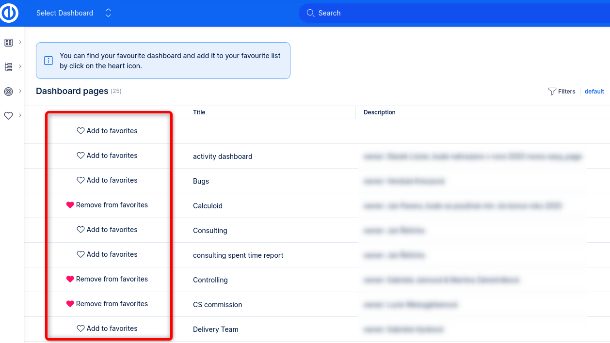
Jump to dashboard
As already mentioned above, the top bar contains a new item, by which you can navigate to custom dashboards.
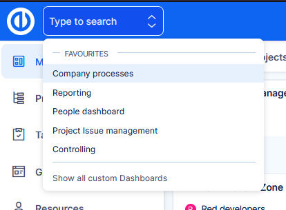
How it works
- User needs permission View custom dashboards enabled to use this feature.
- By clicking Show all custom dashboards you will be directed to the list of dashboards.
- Here you can set dashboards that you often visit, as favourite.
- Your favourite dashboards are then presented directly in the selection from the top bar.
Why this feature?
Custom dashboards have always been a strong asset of our application. However, they were missing an entry point, where users could actually find them. The admin would have to add the link to the left menu, or share it manually some other way. Jump to dashboard feature is the solution to this problem.
Now you can fully unleash the power of dashboarding for any part of your company that is managed in Easy Project.
Custom fields administration improvements
Change that may not affect day-to-day operations, but it does eliminate potentially unfriendly behaviour for admins managing custom fields in the application.
Previously
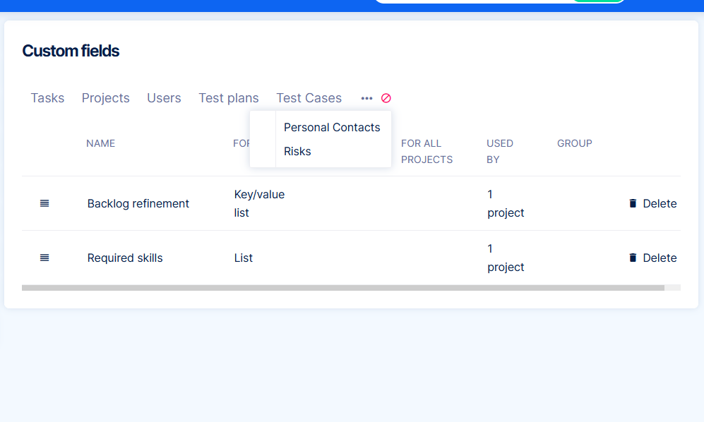
Custom fields were separated by entity type. Some entity types were hidden under ellipsis.
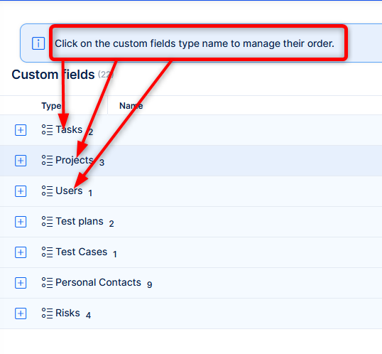
Now
All custom fields are in one filterable list, with ability to search.
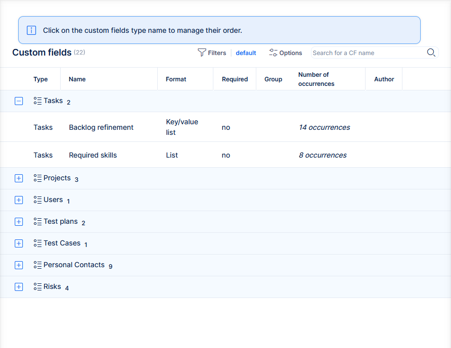
From functional perspective, everything remains as before. By clicking on an entity type, you will get into the view of custom fields on that particular entity type. This view allows setting order of the custom fields.
Time format (1:45 vs 1.75)
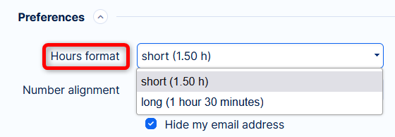
In user profile, you can choose how to show spent time.
Previously
There were options "short" (decimal, e.g. 1,75) and "long" format (1 hour 45 minutes).
Now
1. The "short" format has been renamed to Decimal, works the same as before - 1,75
2. The "long" format has been replaced by a compact form of hours and minutes - 1:45
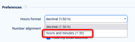
Why the change?
Based on user feedback, it became clear that the old "long" format was not well accepted. It took too much space in reports and was not easily readable. The short format had the problem of calculating in decimal system, which was a "culture shock" for many users, who have never worked with decimal time calculation.
Migration from Tasks from filter widget
In release notes for version 11, we announced that some widgets would be removed. Widget Tasks from filter still existed in the application, if it was added before v11. It was only disallowed to add new widgets of these types.
By upgrading to v13 an automatic migration will transform existing Tasks from filter widgets to their respective followers. The migration covers the vast majority of configurations and basic use cases. Only few corner cases cannot be migrated.
How it works
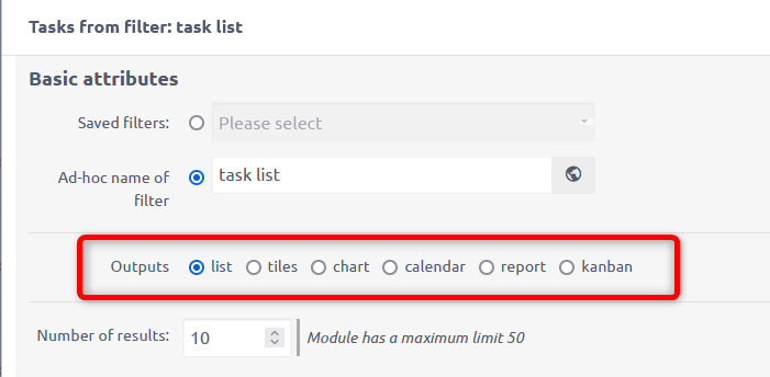
Based on the output setting of the legacy widget, it may be transformed the following ways:
- List - will be migrated to widget List
- Chart - will be migrated to the respective widgets Bar, Line or Pie chart
- Report - will be migrated to widget Pivot table
- Kanban - will be migrated to widget Custom kanban board
Custom kanban board has a more complex configuration (documentation here). It is possible that you will need to adjust some parts of the status mapping within the widget. - Tiles - there is no widget representing this output, it will be migrated to List
- Calendar - there is no widget representing this output, it will be migrated to List
- If multiple outputs were selected, the migration will be into the widget representing the first output type selected
Tiles and Calendar widgets will be lost by the migration. However, there is still a manual workaround to get these outputs on a dashboard, if you really need them.
- Go to task list
- Prepare your tiles or calendar output
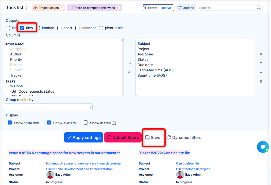
- Save the filter
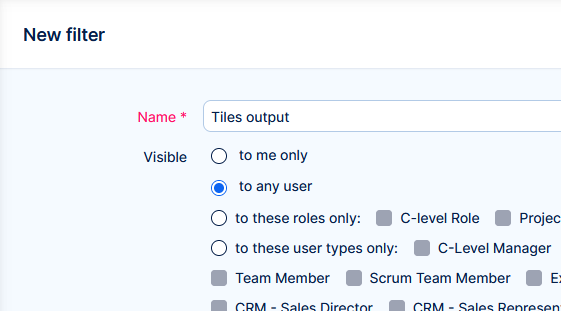
- Go to a dashboard
- Customise
- Add widget List -> Entity - Tasks
- Select the saved filter
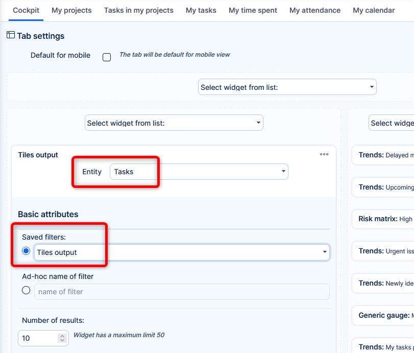
- Save the dashboard
- Share a smile 🙂
In fact, any saved filter in whatever output (or multiple outputs) will be migrated into widget List, but will show the output(s) of the saved filter.
Why the migration?
The old widgets are already functionally replaced. Thus, keeping them in the code/database of the application becomes an unnecessary stability or performance risk. More code => higher bug potential; bigger data volume => higher performance effect.
This migration allows to remove old code and unnecessary data from your application.
Knowledge base vs Knowledge base Legacy
The original Knowledge base is renamed in the application as Knowledge base Legacy. There are no functional changes, this add-on still runs with v13.
The new Knowledge base 2.0 is renamed to simply Knowledge base.
Why?
The original KB in its structure and form has reached its functional peak. There is no technical room for improving its capabilities to today's complex knowledge sharing requirements. This state is practically the definition of Legacy in software terminology.
The mission was taken over by the new Knowledge base, which is built as a specialized professional documentation tool, distantly exceeds any possibilities of the original one. This tool is going to be developed and enhanced in the years to come. The number 2.0 feels excessive, especially if you only have one KB installed.
Zeitwerk support (only for developers of Easy Project)
Developers into Easy Project application should be aware of this change. Details are available in the Developer's portal.
This is not a functional change => users and admins can ignore it.
Why the change?
To keep up with the current and future technological standards.
API change for Lookup custom fields
For lookup custom fields the ID has been renamed to VALUE for consistency with the JSON format and other custom fields.
Before
<custom_field id="", name="", field_format="easy_lookup">
<id></id>
<name></name>
<url></url>
</custom_field>
Now
<custom_field id="", name="", field_format="easy_lookup">
<value></value>
<name></name>
<url></url>
</custom_field>
Changelog
Don't forget to check the changelog for other, smaller changes.